
Why Does Luxury Always Wear Black?

Updated: 6 days ago

Well, almost always. Sometimes it wears Hermès orange, Tiffany blue or Bottega green. And sometimes it throws the rulebook out altogether, like Jaguar did in 2024, swapping the familiar codes of British luxury for vivid pinks, yellows and blues. That's when things get really interesting.
Apparently, luxury has a dress code.
Walk through any premium department store and you'll spot the pattern before you've read a single brand name.
Black. Cream. White. Deep navy. The occasional jewel tone. And, somewhere, inevitably, a little gold.
We've become incredibly good at reading colour before we read words. Expensive or cheap. Serious or playful. Established or disruptive. Natural or clinical.
Most of the time, we don't even realise we're doing it.
But why does black feel expensive in the first place? And if every aspiring premium brand is wearing it, how much does it really say anymore?
Black has a reputation to maintain.
Black carries associations with authority, restraint, formality and exclusivity. Centuries of formal dress, high fashion and luxury marketing have helped reinforce exactly that.
Luxury also has another advantage: it has permission to say less. Less copy. Fewer colours. More space. More restraint. It doesn't need to shout. And somehow, that confidence feels expensive.
But black itself isn't luxurious.
Place black beside beautiful typography, exceptional photography, considered materials and plenty of negative space, and it can feel exquisite.
Put exactly the same black beside a badly kerned gold logo and…
Well. You know.
And then there's gold. Oh, gold. The branding equivalent of saying: "Can you make it look more expensive?"
Gold has centuries of association with wealth, status, rarity and ceremony. Of course it carries meaning.
But gold, just like black, can't manufacture luxury. Adding it to something that doesn't already feel premium can have precisely the opposite effect. Why? Well, it's because luxury isn't a colour combination. It's an expectation.
The product. The positioning. The language. The photography. The packaging. The website. The service. The experience.
They all have to uphold the promise the palette makes. Black and gold can signal luxury. They cannot create it.
We've been conditioned to see it that way.
This is where it get's really interesting, it's where colour psychology comes in. Red means passion. Blue means trust. Green means nature. Yellow means optimism. Black means sophistication. Gold means luxury.
Simple, right?
Except colour psychology isn't a paint-by-numbers exercise.
I've used colour psychology throughout my career. It's an incredibly useful starting point when developing a brand's identity, particularly when you're trying to understand how an audience might interpret what they see.
But it's a starting point. Not a prescription.
Colour doesn't arrive with a fixed personality attached. Context gives it meaning. Culture matters. Category matters. Fashion matters. What your competitors are doing matters. Even the typography, photography, language and other colours sitting beside it can completely change how we perceive it.
Consider black. On a luxury perfume bottle, it might suggest sophistication. On a technology product, precision. On a restaurant menu, contemporary minimalism. On a children's toy, it might feel entirely out of place. Same colour. Different expectations.
And that's the distinction that matters. Colour doesn't tell people what your brand is. It helps them interpret everything else you're telling them.
When everyone looks expensive, nobody does.
Here's where the traditional luxury palette becomes a little less interesting. Imagine walking into a department store where every premium product is packaged in black. Every logo is gold. Every photograph is moody. Every website is minimalist.
Individually, each might look beautiful. Collectively, they start to look remarkably similar.
The very visual language designed to communicate exclusivity becomes commonplace. And if your competitors are all borrowing the same signals, following them may help you look like you belong. It won't necessarily give anyone a reason to remember you.
This is why I find brands that challenge their category's visual conventions so interesting.
Hermès made orange unmistakably its own. Tiffany built extraordinary recognition around a particular shade of blue. Bottega Veneta brought an almost electric green into a world traditionally dominated by considerably quieter palettes. And Jaguar's 2024 transformation deliberately challenged familiar British automotive luxury conventions with a far more exuberant visual identity.
Different brands. Different circumstances. Different creative decisions. But they raise the same interesting question.
What if the colour your industry least expects is precisely the one that makes people notice you?
Of course, being different for the sake of being different is no strategy either. An unconventional palette still has to feel believable coming from the business behind it. But there's a difference between understanding the rules and feeling obliged to follow them.
Where does your Brand sit?
Before choosing, or changing your brand colours, it's worth understanding the associations your audience might already have with them.
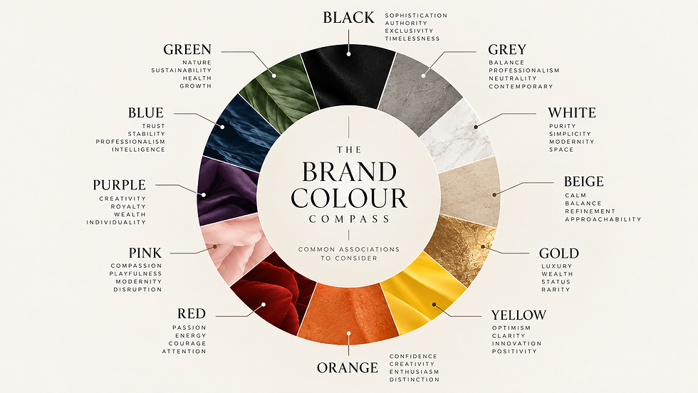
Use the colour compass as a starting point. Look at the characteristics traditionally associated with your palette.
Then look beyond it.
What are the other brands in your category doing? Which colours have become so familiar that they barely register? And which associations might be worth challenging?
Knowing what a colour traditionally communicates is useful. Knowing whether that message actually helps your business is considerably more valuable.
Your favourite colour is irrelevant.
Well, almost.
One of the most dangerous sentences I hear in a branding conversation is:
"I just don't like green."
Completely reasonable when we're choosing your kitchen.
Much less useful when we're building a brand for thousands of people who you want to buy your product or service.
Personal taste inevitably enters the room. We're human. But a strong identity has to survive beyond the preferences of the person who commissioned it.
I've seen businesses become so attached to what they personally like that they forget to consider what their audience needs to understand.
And I've seen the opposite: businesses so concerned with looking like everyone else in their industry that they lose any sense of their own personality.
Neither is particularly useful.
The question isn't whether you like green. It's what green communicates to your audience. What it looks like beside your competitors. Whether it supports the personality you're trying to create. Whether it feels believable coming from your business. And, perhaps most importantly, whether it's doing something useful.
Before you settle on your brand palette, ask yourself three things:
What do I want people to assume about my business before they've read a word?
What does everyone else in my category look like, and why?
Do I want to belong, or be remembered?
Ideally, your brand should achieve all three. It should feel credible within its market while giving people something distinctive to recognise. That's a much better brief than simply asking for something that looks expensive.
Colour me convinced.
Good colour strategy isn't about discovering the scientifically correct colour for your business.
There isn't one.
It's about understanding the associations people already carry, deciding which ones are useful to you and knowing when breaking convention might say considerably more.
Colour can attract attention. Create recognition. Signal personality. Set an expectation before you've written a single word.
But it still needs something underneath it.
Personality gives your brand character. Identity gives it expression.
Authenticity gives people a reason to believe it.
Without those foundations, even the most beautiful palette is just decoration. And perhaps that's why the brands we remember aren't always the ones that followed colour psychology by the numbers.
They're the ones that understood what people expected and knew exactly when to do something different.
One last thought…
If your brand looks exactly how your industry expects it to look, perhaps the more interesting question isn't whether it looks right. It's whether anyone will remember it.
Branding is psychology wearing well-considered clothes.
Comments